CopenhagenAir
2016, data visualization, tangible computing
In collaboration with
Justin Danemann
Tools used
Javascript, Arduino, Processing, Ableton Live
Data can be both abstract and difficult to set in relation to the world. Especially “invisible” phenomena such as climate change, Wi-fi, and energy use among others. To understand a set of data, we often need to process and translate the data in a way that helps us interpret and grasp the data.
However, pixel and screen-based visualizations that only appeal to the eye might have certain limitations when it comes to leaving an impression that is comprehensible in relation to the world.
Our definition of data experience is designed around two phases: data gathering and data representation. Inspired by the wave of citizen science, we have created a device that is capable of measuring air pollution and GPS data while riding a bike.
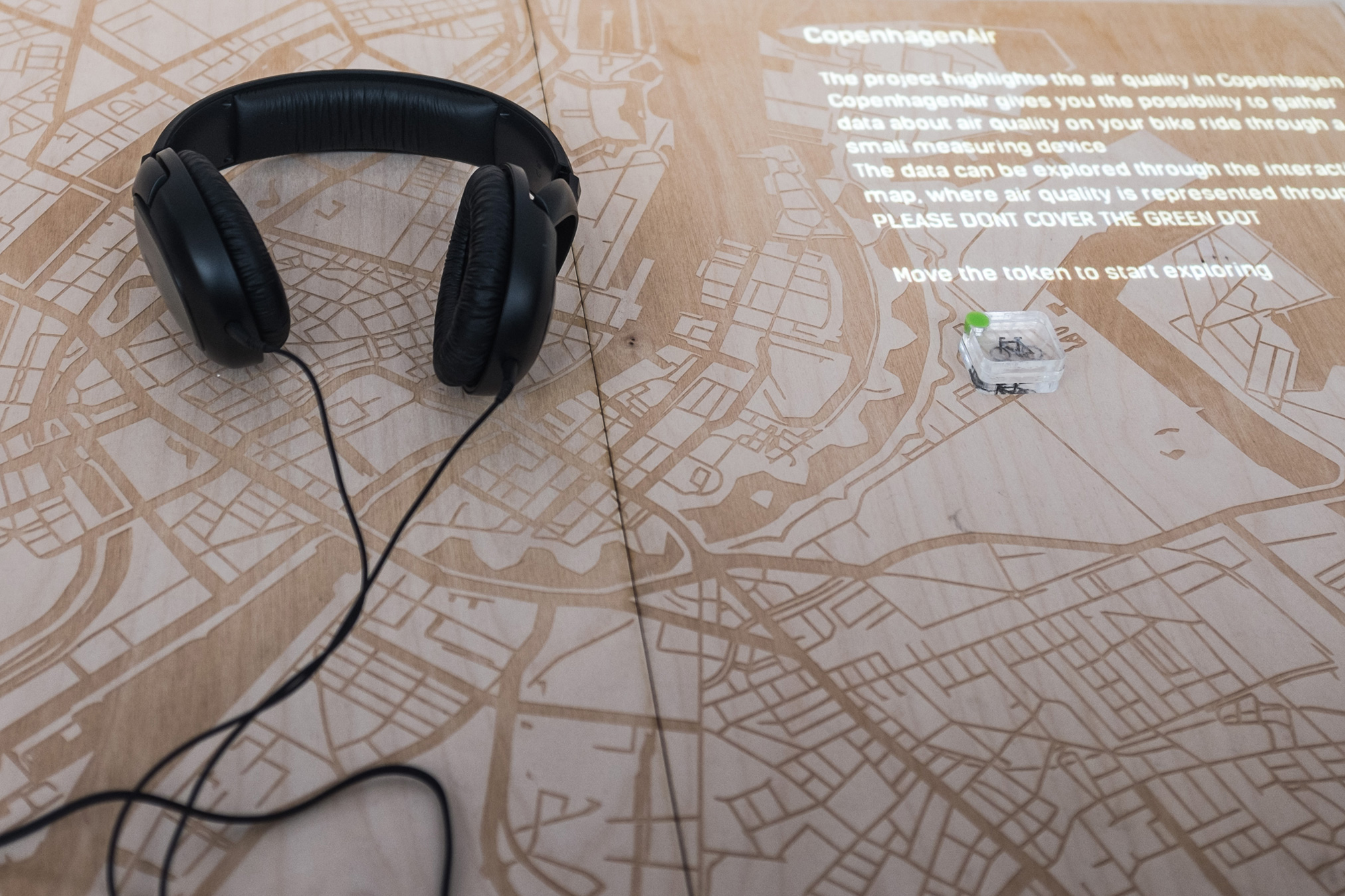
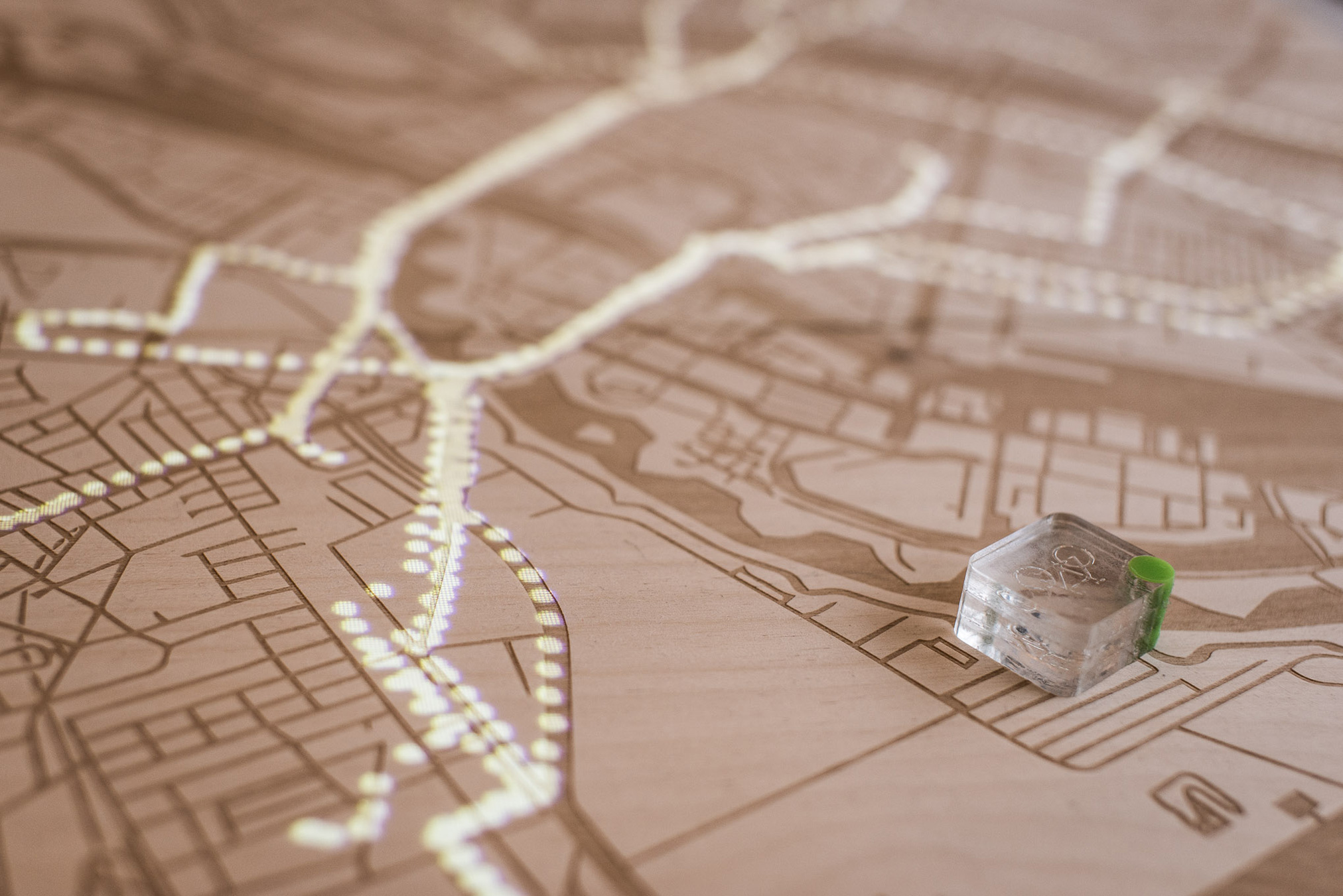
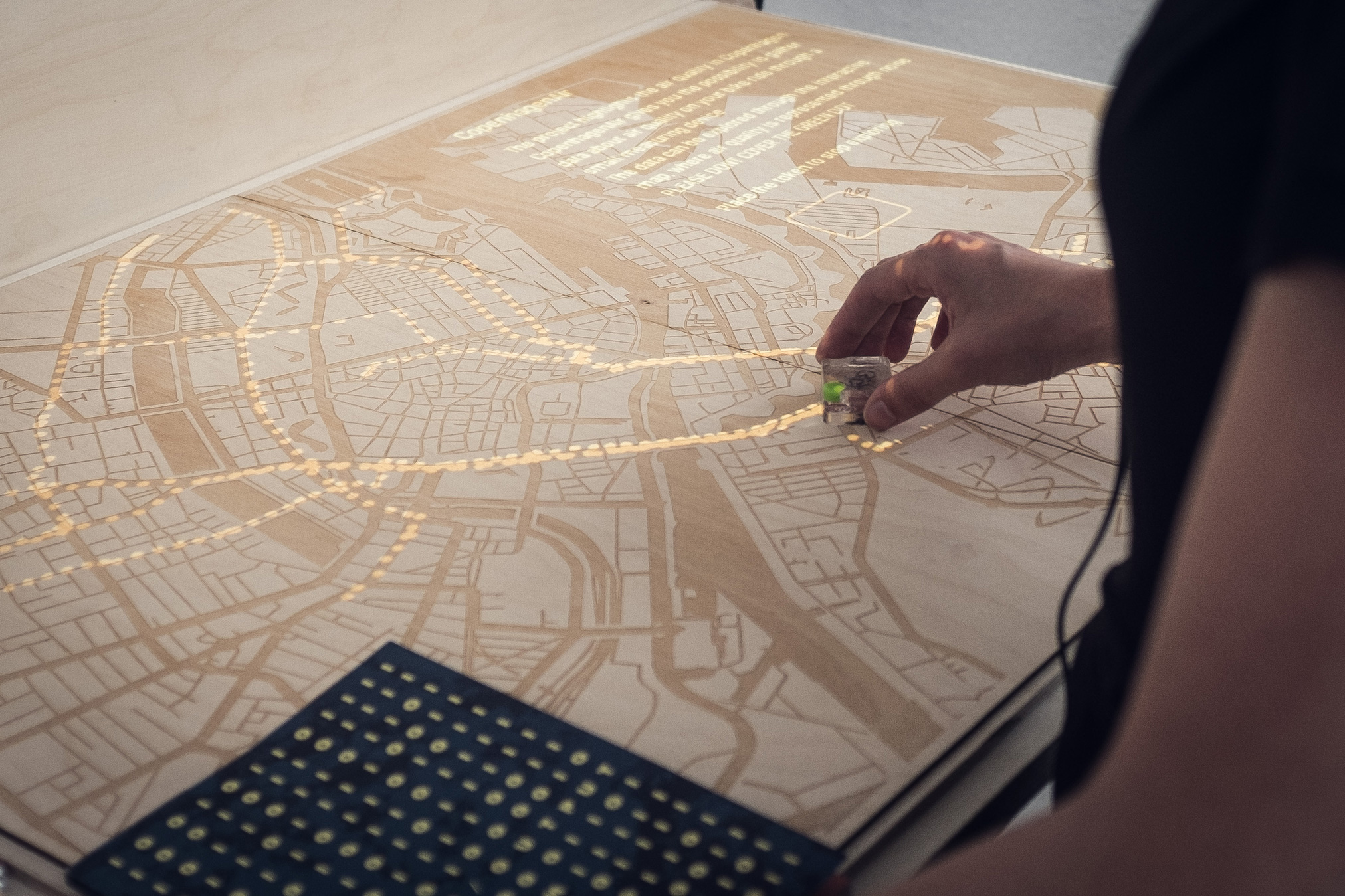
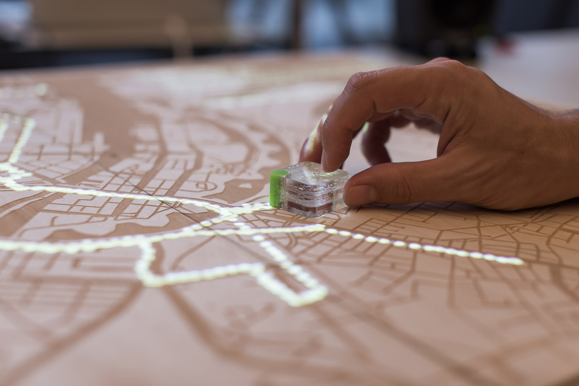
The data is logged and later represented through an interactive wooden map, which works as a tactile interface, that allows the user to explore different routes in Copenhagen, and sense the change of pollution levels through sound.
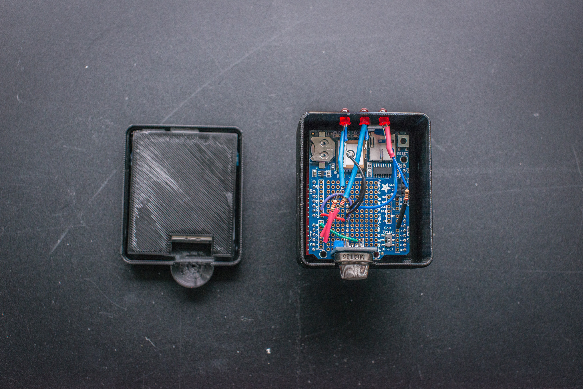
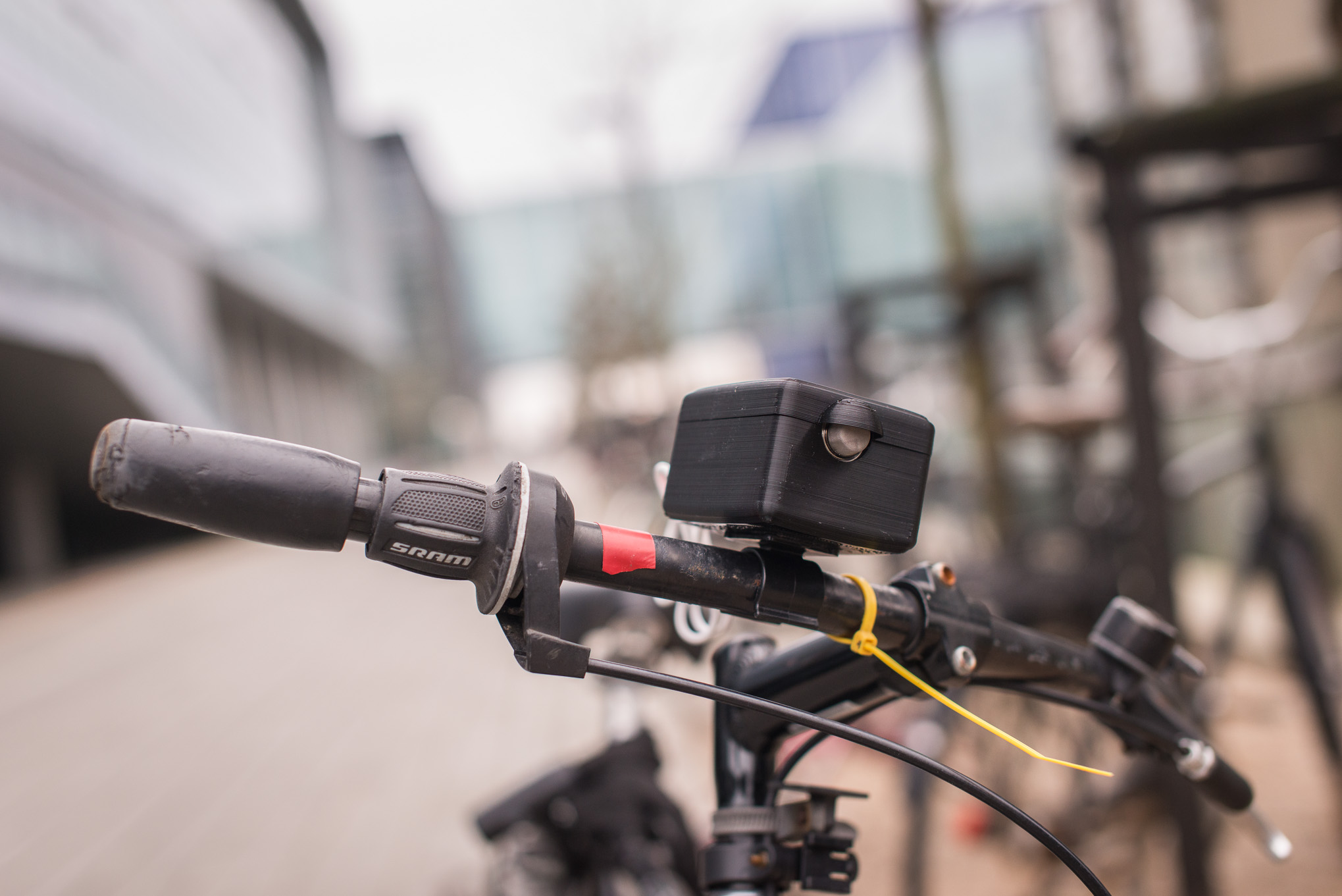
The pollution sensor gives the user the possibility to measure air quality on their daily bicycle routes. Three LEDs on the device communicate synchrony feedback based on the pollution level. The goal is to contextualize pollution in the city and make the data both more personal and relevant for the user.
Inspired by the concepts of data art and science art, the interactive map is designed to give a multi-sensory experience, while the user explores the collected data. The goal of the installation is to explore potential qualities in multisensory experiences, in the context of communicating the overall climate issue.